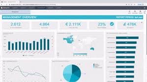
Dash Board designing - We can show big data's information simply and important bullets which details will be in excel sheet.
Dash board explains simply and clear understanding about professional details/ information to our senior or Management department, massive help to acquire relevant details or data to present professionally, It is important and becoming successful career.
Dashboard we can make as per help of Pivot table, Please find below whole knowledge for Pivot and dashboard Regarding.
What is Pivot Table-
Pivot Tables are a feature within Microsoft Excel that takes individual cells or pieces of data
and lets you arrange them into numerous types of calculated views. These snapshots of
summarized data require minimal effort to create and can be changed by simply clicking or
dragging which fields are included in your report.
By using built-in functions and filters, Pivot Tables allow you to quickly organize and
summarize large amounts of data. You can filter and drill-down for more detailed examination of
your numbers and various types of analysis can be completed without the need to manually enter
formulas into the spreadsheet you’re analyzing.
For example, the below Pivot Table is based on a detailed spreadsheet of 3,888 individual
records containing information about airplane parts. In less than 1 minute, I was able to produce
the following report for the quantity of parts sold by region
In today’s world where massive amounts of information is available, you may be tasked
with analyzing significant portions of this data, perhaps consisting of several thousand or
hundreds of thousands of records. You may have to reconcile numbers from many different
sources and formats, such as assimilating material from:
1. Reports generated by another application, such as a legacy system
2. Data imported into Excel® via a query from a database or other application
3. Data copied or cut, and pasted into Excel® from the web or other types of screen
scraping activities
4. Analyzing test or research results from multiple subjects
One of the easiest ways to perform various levels analysis on this type of information and more is
to use Pivot Tables.
Building A Basic Pivot Table & Chart
In this chapter we will review the fundamental steps of creating and modifying a Pivot Table.
Here we will take a basic spreadsheet containing fruit sale information and:
1. Determine the total sales by region and quarter
2. Create a chart that displays the sales by region and quarter
3. Display the individual fruit sales by region and quarter
Summarizing Numbers
Sample data for chapters 3-5, due to space limitations the entire data set is not displayed.
1. Open the FruitSales.xlsx spreadsheet and highlight cells A1:I65
2. From the Ribbon select INSERT : PivotTable
The following dialogue box should appear: 
3. When prompted, verify the 'New W orksheet’ radio button is selected
4. Click the 'O K ’ button
A new tab will be created and appear similar to the following. Note: the ‘PivotTable Fields’
pane on the right side of the new worksheet.
Next, w e’ll “categorize” our report and select a calculation value.
5. Inside the PivotTable Fields pane click the ‘REGION’ box or drag this field to ‘Rows’
section.
6. Inside the PivotTable Fields pane click the ‘TOTAL’ box or drag this field to ‘£ Values’
section.
7. We can change the column labels and format of the numbers. In the below example:
1. Select cell ‘A3’ and change the text from ‘Row Labels’ to ‘REGION’
2. Select cell ‘B3’ and change the text from ‘Sum of TOTAL’ to ‘TOTAL
SALES’
3. You may also change the currency format in cells ‘B4:B7’. In the below
example, the format was changed to U.S. dollars with zero decimal places
8. Inside the PivotTable Fields pane drag the ‘QUARTER’ field to the ‘Columns’
section
We now have ‘QUARTER’ added to the summary
9. Select cell ‘B3’ and change the text from ‘Column Labels’ to ‘BY QUARTER’
10. The labels for cells ‘B4’, ‘C4’, ‘D4’, & ‘E4’ were changed by adding the
abbreviation text 'Q T R ’ in front of each quarter number
How To Drill-Down Pivot Table Data :
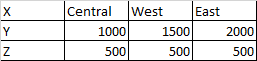
Before we continue with our Pivot Table report examples, let’s say you wanted to investigate
further why the Central region’s Q1 results are so much higher than the other two regions.
Pivot Tables allow you to double-click on any calculated value to see the detail of that
cell. You may also right-click on the calculated value and select ‘Show Details
Note: If you do not see the PivotTable Tools option on your Ribbon, click any
PivotTable cell. This toolbar option only appears when a PivotTable field is
active.
The following dialogue box should appear:
Select the ‘Bar’ option
Click the ‘OK’
button
A chart similar to the below should now be displayed:
http://bentonexcelbooks.my-free.website/excel-2016


Comments
Post a Comment